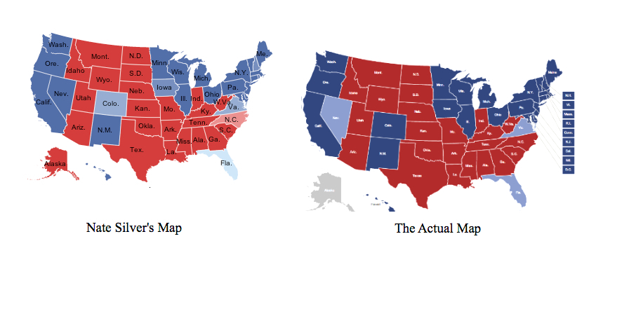
This comparative map from I Love Charts via Julia Topaz display’s Nate Silver’s final election prediction vs the final outcome. It’s an amazing example of how statistics and probability can be used to understand complex human systems in understandable ways. We also like to think that it shows something else – we believe that, no matter your political affiliation, the most important thing is making sure our voices are heard and dialogue is had. It’s the only way to get anything done.
-Jenna Silcott
Information Architect
Urban Decision Group
